Choosing a nameplate that reads across the room
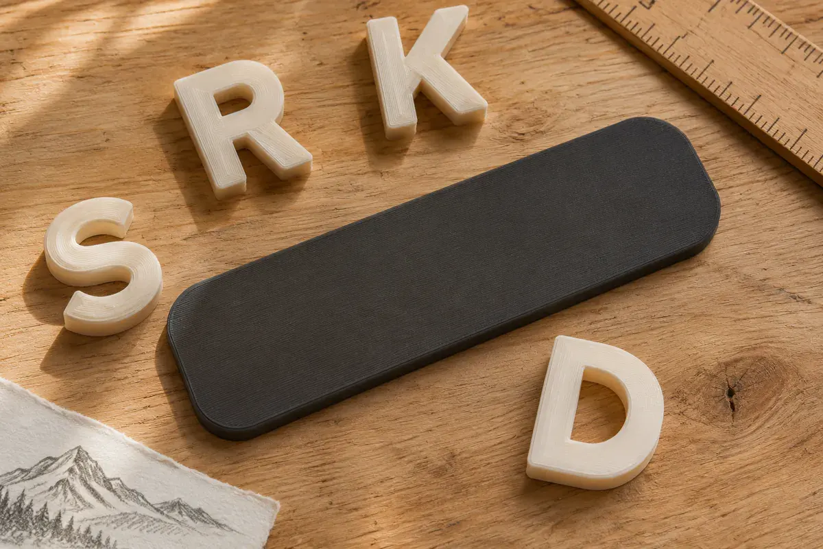
A nameplate has two audiences. You see it from your chair, often at a sharp angle. Someone visiting your desk sees it from the doorway. Before choosing a typeface or a mountain silhouette, it helps to stand in both places.
Start with a piece of paper
Fold a strip of paper into a tent and write the name at the size you have in mind. Set it where the finished piece will sit. Walk to the entrance, then sit down on the other side of the desk. If the monitor hides half the name from one spot, move the paper first. A taller or larger plaque might solve a problem that a small shift in position would have fixed.
Trace the folded strip onto a second sheet. Those pencil marks give you a useful footprint to compare with the dimensions of a listing.
Give the letters some breathing room
Try the full name on one line, then try a first name with a smaller second line. Long names often benefit from a wider plaque. Squeezing letters closer together makes the gaps in an “e” or an “a” hard to see, especially when the lettering is raised.
Look at the design in ordinary room light. Contrast between the face and the lettering does more for readability than adding a decorative border. Ivory on charcoal is one example. A shadow cast by raised letters can add definition, but its direction changes as the light moves.
Leave room for the rest of the desk
An icon feels most at home when it has a little space of its own. In the mountain nameplate concept, the silhouette sits beside the name. On a shorter plaque, a single peak might leave a better margin around the first letter.
Keep the paper version on the desk for a day. Reach for your notebook and put down a mug as usual. By the end of the day, you will know whether that spot belongs to the nameplate.